About Lesson

This editor is where the magic happens. We’ll tell it what we want to do, then click on Add to Chart to see our annotations appear above. Note that things can get messy if we include several annotations at once, so we’ll remove them between examples (right-click in the chart > Remove Indicators).
You can see that we already have a couple of lines of code there. Let’s click Add to Chart to see what happens.
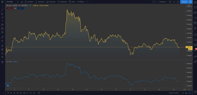
A second chart gets added beneath the original. The new chart happens to represent the same data. Hover over My Script and click on the cross to remove it. Now, let’s dig into the code.
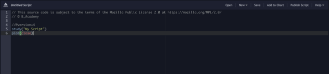
study("My Script")This first line is just setting up our annotation. It only requires the name that you want to call the indicator (“My Script”, in this case), but there are also some optional parameters we can add. One of those is overlay, which tells TradingView to place the indicator on the existing chart (instead of in a new segment). As you can see from our first example, it defaults to false. Though we won’t see it in action now, overlay=true adds the indicator to the existing chart.
plot(close)This line is the instruction to plot the close price of Bitcoin. plot simply gives us a line chart, but we can also display candlesticks and bars, as we’ll see shortly.
Now, let’s try the following:
//@version=4
study("My Script", overlay=true)
plot(open, color=color.purple)
Once you add this, you should see a second chart (which looks like the original shifted to the right). All we’ve done is plotted the open price instead, and since the current day’s open is the previous day’s close, it makes sense that these have an identical shape.
Okay! Let’s get rid of the current annotations (remember, we do that by right-clicking and hitting Remove Indicators). Hover over Bitcoin / BUSD and click the Hide button to clear the current chart, too.
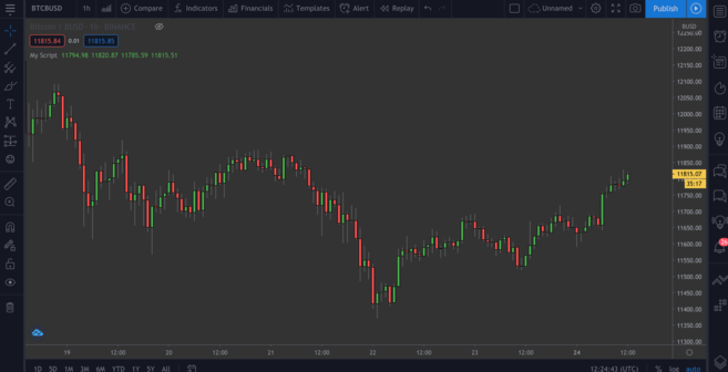
Many traders prefer candlestick charts as they give us more information than a simple plot like the one we just did. Let’s add them next.
//@version=4
study("My Script", overlay=true)
plotcandle(open, high, low, close)
It’s a good start, but the lack of colors makes it a bit bland. Ideally, we should have red candles when the open is greater than the close for the given timeframe, and green ones if the close exceeds the open. We’ll add a line above the plotcandle() function:
//@version=4
study("My Script", overlay=true)
colors = open >= close ? color.red : color.green
plotcandle(open, high, low, close)
This looks at every candlestick and checks whether the open is greater or equal to the close. If it is, it means prices have dropped over the period, so it will color the candlestick red. Otherwise, it will color it green. Modify the plotcandle() function to pass this color scheme in:
//@version=4
study("My Script", overlay=true)
colors = open >= close ? color.red : color.green
plotcandle(open, high, low, close, color=colors)
Remove the current indicators if you haven’t already, and add this one to the chart. Now we should have something resembling a regular candlestick chart.
Beautiful!